Who wouldn’t take up on the chance to live in a world where you can escape from the mundane routine of real life? Virtual reality innovations in itself have been pulled straight out of science fiction. The Matrix was the movie that struck a chord with people at the time, and opened up a new world of imagination and awe for the technology visionaries. Back then the gap between the Matrix world and real world technology was huge. But today, VR technology has made progress so much so that the world in Ready Player One doesn’t sound too farfetched anymore.
Sci-fi movies have long been a source of inspiration for virtual reality developers. There have even been a lot of inventions pulled directly from the movies, and not just in virtual reality. While this sounds like a great premise for the future of VR, it also creates a hitch in the stride of development. Not everything you see in a science fiction movie is going to be functional in virtual reality. Particularly, when talking about User Interface (UI).
Here’s why it’s not always ideal to replicate the UI in sci-fi movies to your version of VR:
The Trick Is In Simplicity
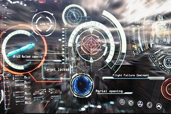
Adding UI in virtual reality can be tricky. Movies like Minority Report and Ironman make it look really easy to have all the floating UIs in front of you. It looks cool without a doubt. But having multiple interfaces open in front of you can obscure your view of what’s lying beyond. Even though it can be a good idea for augmented reality, using a complex set of UI elements in your heads up display will be nothing more than a distraction.

Simpler the UI, better the experience will be in virtual reality. User interface in VR is already restricted by a few conditions. You can never add a completely opaque UI in VR game or experience. For it to be workable and not cut off users’ view of other elements in the experience, it needs to have a certain percentage of transparency.

It’s Not All UI
Some developers may get carried away in creating the movie look of their games and experiences in virtual reality. What needs to be remembered at all times is that the goal is not to create a UI-centric experience, but to design it around the primary purpose of that experience. Although it can be a big plus for the game or experience in VR, UI is hardly the thing that decides the fate of your product. Nobody’s going to whoop in joy and appreciate even the coolest looking interfaces if all they do is block them from the necessary information.
Damning Details
You may have heard of “Devil is in the details” but that’s not how it works when it comes to virtual reality user experience. Excessively detailed UI and complex sets of information, no doubt, look awesome but is it possible to replicate it at current state of VR technology? Possibly. Would it be without consequences? Probably not. With more complexity, more processing power will be needed. Since VR hardware has still a long way to go, there’s a high risk of information overloading.
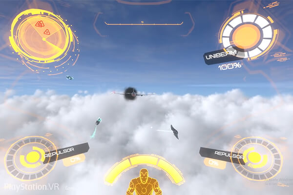
Here’s a side by side comparison of how the Ironman game UI differs from that of the legendary Tony Stark’s tech savvy suit:


What’s Ideal?
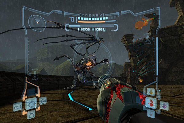
Best ways of virtual reality user interface are either fixing the UI and providing free head movement to users or integrate it so that it smoothly follows the movement of the user. This is of utmost importance that the UI doesn’t suddenly flash in front of you, rather it needs to follow your head movement smoothly. In case it’s jerky and doesn’t offer smooth transition then it may lead to nausea and motion sickness. Take the following games for example, which offer simple UI that not only looks cool but works for the best as well.
Resident Evil – Fixed UI with Free Head Movement

Lone Echo – Interactive UI with Free Head Movement
Source: Road to VR
Iron Man – Fixed UI with Free Head Movement
Source: Iron Man VR by Marvel
This is not to say that there’s anything wrong to take inspiration from science fiction but to remind that not everything will look and work the same. While the movie directors and authors are more interested in telling their stories, game designers need to create an experience that revolves around the user.
